Mahalanobis Distance & Turbulence

I came across this formula when studying portfolio allocation and thought this was interesting, something I had not seen in much literature or in my finance course. Hope you find this as interesting as I did.
Enter the Mahalanobis Distance, what this can do is measure the change in dispersion between variables. In general terms that is the change in how variables move around each other and a mean. This is important as the more there is dispersion, the more turbulence there is and the more likely a regime change is occurring. A regime change is when the current model of the market: prices, betas, correlations and sentiment breaks down. because of this; the Mahalanobis Distance IS our mathematical model for turbulence in this article.
The formula for turbulence at time t for a given vector of n assets is:
Turbulencet = 1/n (y - 𝜇 ) Σ -1 (y - 𝜇 )'
Where:
y = vector of multivariate measurements (think returns)
𝜇 = sample average vector
Σ = sample covariance matrix
Whilst it may not be obvious why this excites me, I will try to explain this all below.
What we are doing is that we are looking at how multiple variables are moving, and if they are moving abnormally. Using the Mahalanobis distance we can measure extreme price movements as well as the correlations between prices of assets. By multiplying the formula by 1/n we get an expected value of turbulence to be 1. The inverse covariance matrix puts things into perspective, and embeds the expected relationships between securities. The way I understand this mathematical formula is by thinking of an elastic band. If the band is stretching, we want to know if the band is stretching further than usual.
If you're confused let me show you how it works. This is using an example from Kritzman and Li 2010.
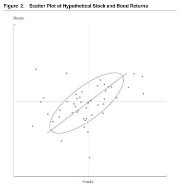
What they did was use the statistical measure of turbulence to look at two return series, the price of stocks and bond jointly. Each point in the above graph represents a period. The centre is average of the joint returns and the boundary ellipse is the tolerance boundary. The points outside the boundary are turbulent periods, those inside represent quiet periods or normal periods. Also notice that some return periods (points) are in the middle of the graph but outside of the boundary. What this shows us is that some periods are not turbulent because of the returns themselves but because the returns of the bonds and stocks moved in the opposite direction in that period. This is despite the fact that the assets are positively correlated, as evidenced by the slope of scatter plot (Kritzman and Li 2010).
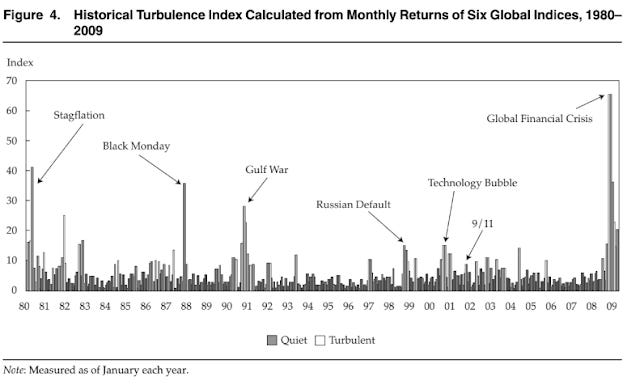
Further to how good it is at predicting turbulence, using the monthly returns for six asset-class indices Kritzman and Li (2010) showed when things could get turbulent. The spikes in the index coincided with known times of stress. This is shown below.
The great thing about this tool is what we can do with it. Not only can we use it in hindsight we can use it to be proactive investors. We can forecast returns into the future and see what our portfolio turbulence will be against turbulence for all assets - see Sénéchal & Singer 2016 if that interests you. Doing this would allow us to tactically react to regime shifts and hopefully create alpha.
Resources:
Kinlaw, Kritzman & Turkington 2017
Kritzman & Li 2010
Sénéchal & Singer 2016 - particularly recommend reading this one if you are interested in the use of the formula
Stockl & Hanke 2014